Logo Guidelines
The NayaOne logo is a visual representation of the NayaOne brand. It is used to identify the NayaOne brand across all applications and marketing materials.
Logo variants
Section titled “Logo variants”The NayaOne logo is available in four variants to suit different contexts and backgrounds.
Horizontal
Section titled “Horizontal”
Vertical
Section titled “Vertical”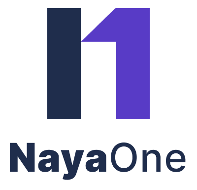
Logo Usage Rules
Section titled “Logo Usage Rules”DOs
- Use approved logo variants
- Maintain clear space
- Ensure sufficient contrast
DON'Ts
- Stretch or distort the logo
- Change colors
- Add effects (shadows, gradients)
- Rotate or crop the logo
Clear space
Section titled “Clear space”A minimum clear space must be maintained around the logo to ensure visibility and legibility. The clear space is defined as X, based on the logo proportions.
Minimum size
Section titled “Minimum size”To preserve legibility, the logo must not be displayed smaller than:
- 24px height (digital)
- 15mm height (print)
Color usage
Section titled “Color usage”- Use the primary logo on light backgrounds
- Use the inverted logo on dark backgrounds
- Do not place the logo on low-contrast backgrounds
Placement
Section titled “Placement”- Top-left placement is preferred
- Maintain consistent alignment within navigation headers
- Do not center the logo arbitrarily
Logo in UI
Section titled “Logo in UI”Application header
Section titled “Application header”Use the primary or symbol logo, aligned with navigation.
Authentication screens
Section titled “Authentication screens”Use the primary logo with sufficient spacing.
Favicon and app icon
Section titled “Favicon and app icon”Use the symbol-only variant only.
Image ratios
Section titled “Image ratios”To keep layouts consistent and avoid unexpected cropping, use the recommended aspect ratios below for different image types.
| Image type | Recommended ratio | Reason |
|---|---|---|
| Card cover image | 3 / 2 or 16 / 9 | Horizontal, predictable grid |
| Vendor logo | 1 / 1 | Logos must be square |
| Avatar | 1 / 1 | Circular / square crop |
| Demo / marketing image | 16 / 9 | Wide visuals |
| Empty state Illustration | auto (no ratio) | Illustration controls layout |
| Sign-in / auth illustration | 3 / 4 | Portrait layouts |
Accessibility
Section titled “Accessibility”- Logo must meet contrast requirements against its background
- Logo used as a link must have an accessible name
- Do not rely on the logo alone to convey critical information